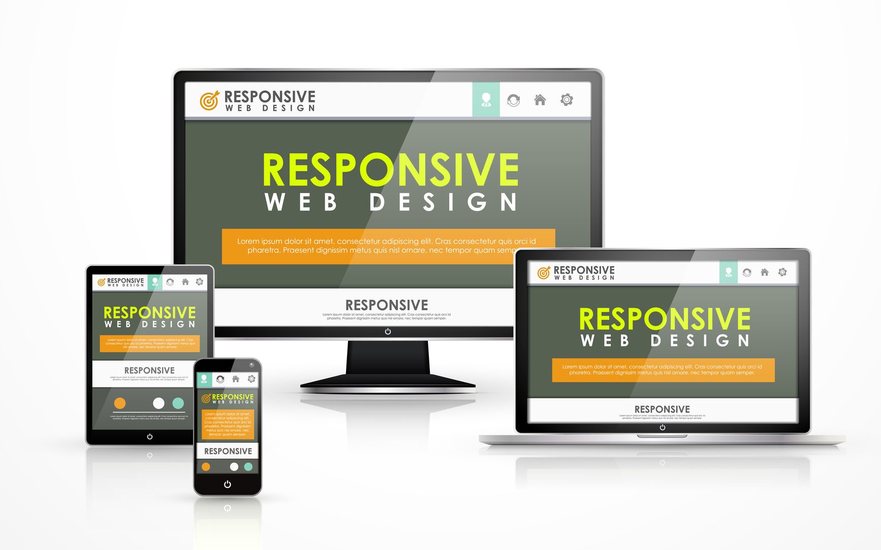
Responsive Web Design
Responsive web design (RWD) is an approach to web design that makes web pages render well on a variety of devices and window or screen sizes. Recent work also considers the viewer proximity as part of the viewing context as an extension for RWD. Content, design and performance are necessary across all devices to ensure usability and satisfaction.
- A site designed with RWD adapts the layout to the viewing environment by using fluid, proportion-based grids, flexible images, and CSS3 media queries, an extension of the @media rule, in the following ways:
• The fluid grid concept calls for page element sizing to be in relative units like percentages, rather than absolute units like pixels or points.
• Flexible images are also sized in relative units, so as to prevent them from displaying outside their containing element.
• Media queries allow the page to use different CSS style rules based on characteristics of the device the site is being displayed on, e.g. width of the rendering surface (browser window width or a physical display size).
• Responsive layouts automatically adjust and adapt to any device screen size, whether it is a desktop, a laptop, a tablet, or a mobile phone.

